Build Custom Applications Effortlessly with ProAppDesigner
Empower your business with ProAppDesigner, a no-code solution designed to create and customize applications within Aras Innovator. Simplify development, enhance user experience, and accelerate deployment—all without extensive coding.

What is ProAppDesigner?

Drag-and-Drop UI Designer
Build applications in Aras Innovator using a rich set of UI controls and backend components—entirely through configuration.
No-Code Modern UI
Generate complex, responsive, and mobile-friendly interfaces effortlessly, without writing any code.
TemplateStudio
Create item detail and item dashboard templates to structure and display data effectively.
Wizard-Based UI
Configure wizards to guide users through item details and workflows dynamically at runtime.
Comprehensive Dashboards
Create Type and Global Dashboards for different roles, allowing users to access item insights efficiently.
Customizable Views
Users can personalize wizards and dashboards by creating their own views on top of admin-defined configurations.
Advanced UI Features
Supports conditional display, validation rules, computed values, dynamic formatting, and Excel-like worksheet controls.
Automated Document Generation
Seamlessly generate Word, PDF, and PowerPoint documents through wizard selections.
Seamless Integration & TDP Support
Export/import Technical Data Packages (TDP) for offline access and updates, working with Aras Innovator 12SP5+ in both on-premises and enterprise deployments.
Benefits of ProAppDesigner
Intuitive Data Visualization
Create and visualize data effortlessly with a modern UI powered by a rich set of UI controls.
No-Code UI Development
Build complex, responsive, and high-performance applications without writing a single line of custom code.
Guided UI for Data Entry
Design structured, long data entry forms with conditional display logic using simple expressions.
80% Faster Development
TemplateStudio-driven UI configuration accelerates development compared to traditional custom coding.
Empowers Business Users
Enables users without programming experience to create sophisticated application interfaces.
Seamless Upgrades
Independent of Aras Innovator versions, ensuring hassle-free upgrades and future-proof implementation.
Cost-Efficient Backend
Reduce server-side development costs with ready-to-use backend components for common business needs.

Typical Workflow
- Create Data Model: Define ItemTypes & RelationshipTypes for the application.
- Design UI Template: Create a UI Template for the root ItemType and bind it to the Data Model.
- Test with Preview: Use the Preview feature to thoroughly test the template before deployment.
- Publish Template: Move the template through the Lifecycle for final deployment.
- Integrate with Innovator: Once published, Create, View, and Edit actions in Innovator will use the new template.

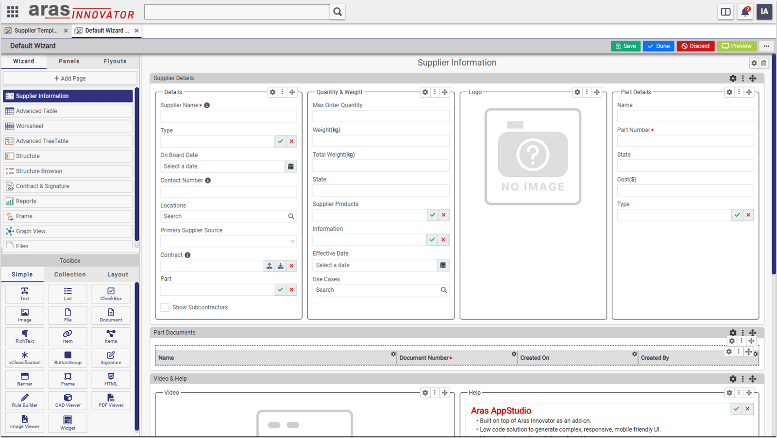
Template Studio
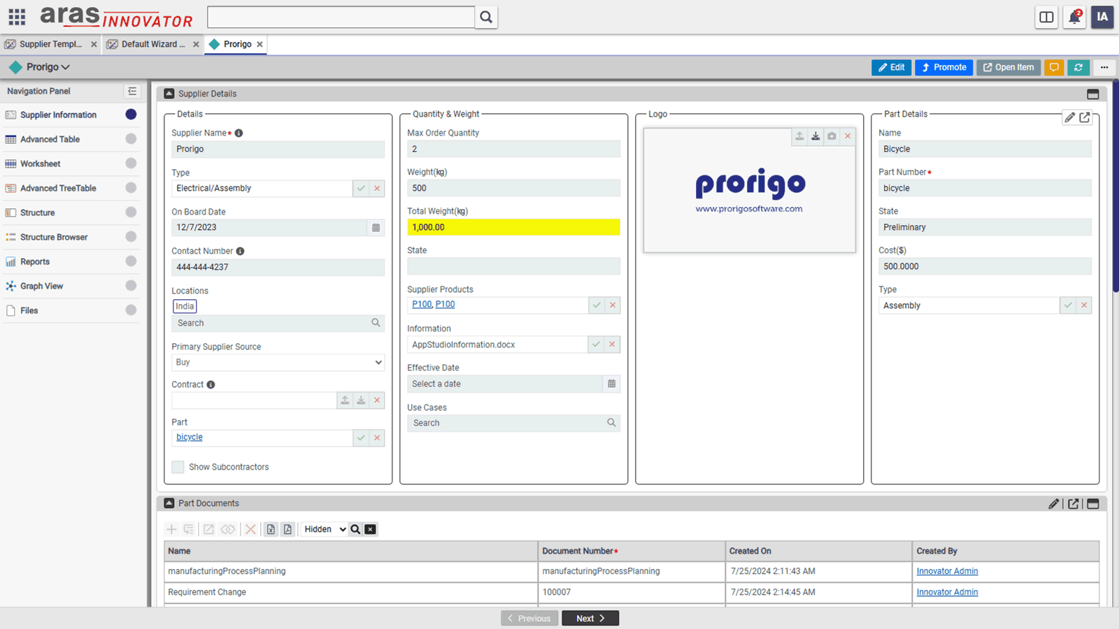
Wizard is used to show details of the selected item at runtime. When item is selected from Innovator search grid, if the item type has published ProAppDesigner template, item details will be shown using the template instead of using default Innovator form.
- Comprehensive Item Display: The wizard includes simple and collection controls to present item properties and relationships.
- Edit & Read-Only Modes: View item details in both read-only and edit modes using the same template.
- Role-Based Access: Dynamically hide controls based on the current user’s roles.
- Multi-Page Navigation: If an ItemType template has multiple pages, a navigation panel is displayed.
- Seamless Page Navigation: Navigate between pages using bottom navigation buttons.
- Validation Feedback: Displays an error icon on the navigation panel if a user moves away from a page with validation errors.
- User-Customized Views: End users can personalize the wizard view for a specific ItemType at runtime.
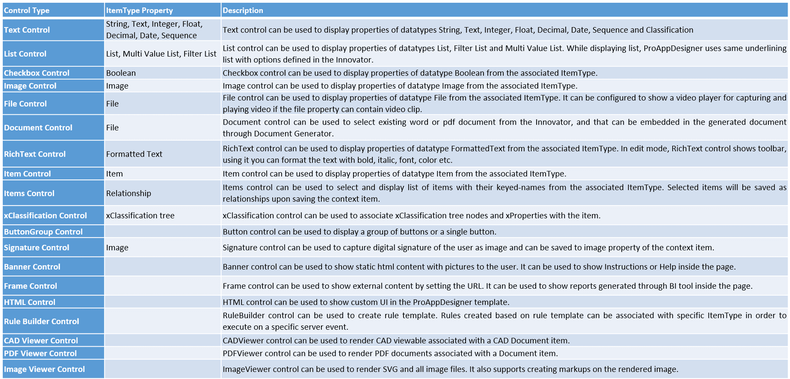
Template Studio Controls
Controls in the ProAppDesigner are the basic building blocks using which complex UI can be created. Controls are broadly categorized into the following categories.
- Simple Controls: Simple controls can be used to show data from an item or its properties
- Collection Controls: Collection controls can be used to show data related to collection of items and their relationships
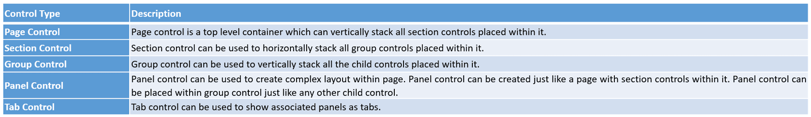
- Layout Controls: Layout controls can be used to organize simple and collection controls with a proper layout in the UI
Wizard
Wizard is used to show details of the selected item at runtime. When item is selected from Innovator search grid, if the item type has published ProAppDesigner template, item details will be shown using the template instead of using default Innovator form.
- Wizard Controls: Includes simple and collection controls to show properties of the current item and its relationships.
- Read & Edit Modes: Displays item details in both read-only and edit modes using the same template.
- Role-Based Visibility: Hides controls in the template based on the current user’s roles.
- Multi-Page Navigation: If an ItemType template has multiple pages, a navigation panel is displayed.
- Navigation Buttons: Provides Next and Previous buttons at the bottom for easy navigation.
- Validation Warnings: Displays an error icon on a page in the navigation panel if the user navigates away without fixing validation errors.
- Custom Views: End users can create their own views for the Wizard of a specific ItemType by customizing it at runtime.
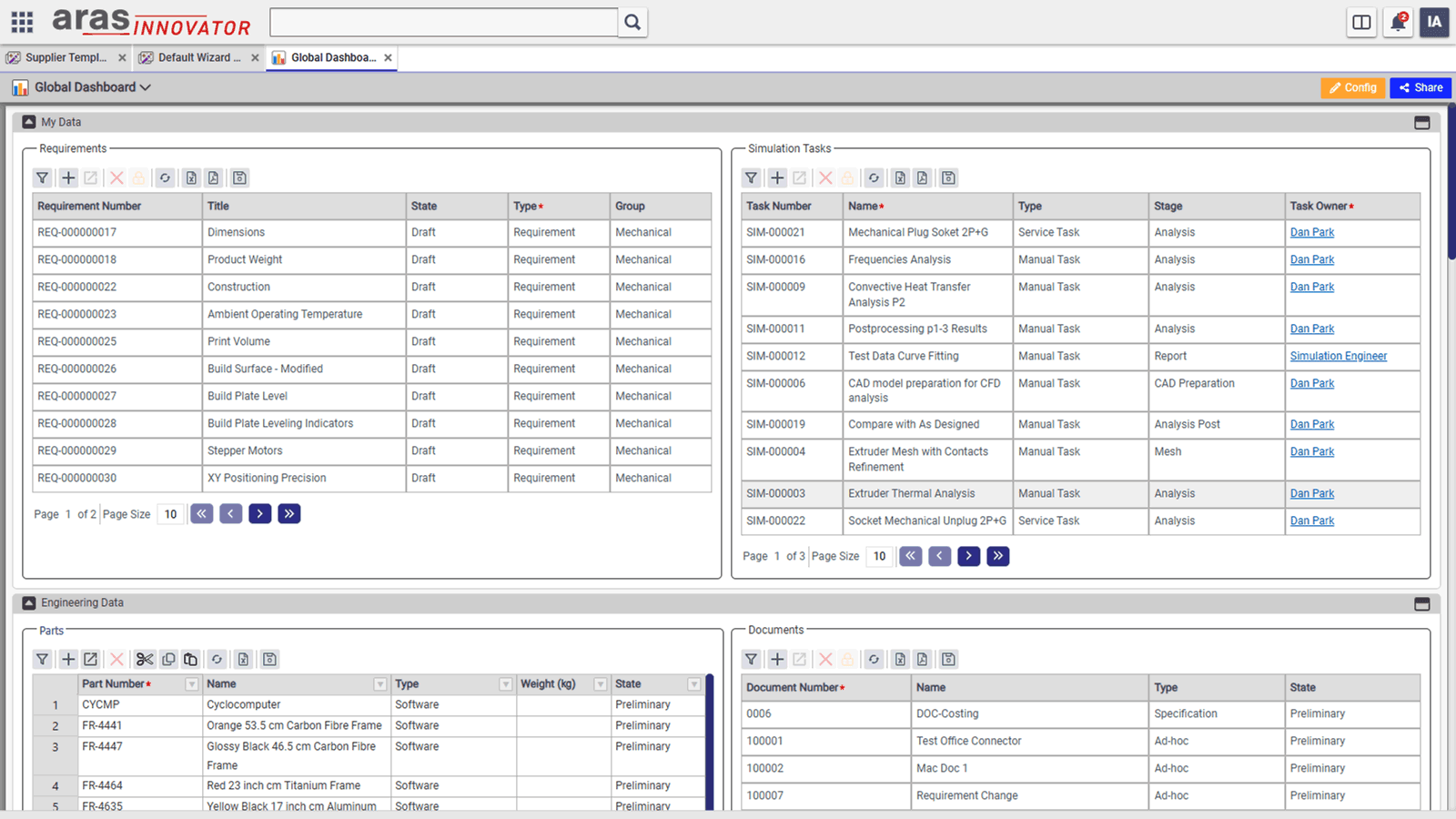
Dashboards
- Type Dashboards: Displayed based on the Dashboard template created for a specific ItemType in Template Studio.
- Global Dashboard: Displays data related to multiple ItemTypes, based on the Global Dashboard template in Template Studio.
- User Dashboards: End users can create their own dashboards by customizing the default ones shown to them.
- Dashboard Components: Dashboards can include tables, worksheets, reports, embedded external content, and PowerBI reports.
- Pre-Applied Filters: Dashboard tables and worksheets come with pre-applied filters for streamlined data display.
- Custom Filtering: If admin-defined filters are not enforced, users can modify filters using advanced operators in the expression builder.
- Role-Specific Views: Supports role-based dashboards, with specific tables and columns tailored for different user roles.
- Edit & Read-Only Modes: Dashboard tables and worksheets can be displayed in edit or read-only mode, with conditional formatting and computed columns.
- Inline Editing: Users can edit item data directly within tables/worksheets and save changes in bulk without opening the item details page.
- PowerBI Integration: PowerBI reports can be embedded directly within dashboards for advanced analytics.
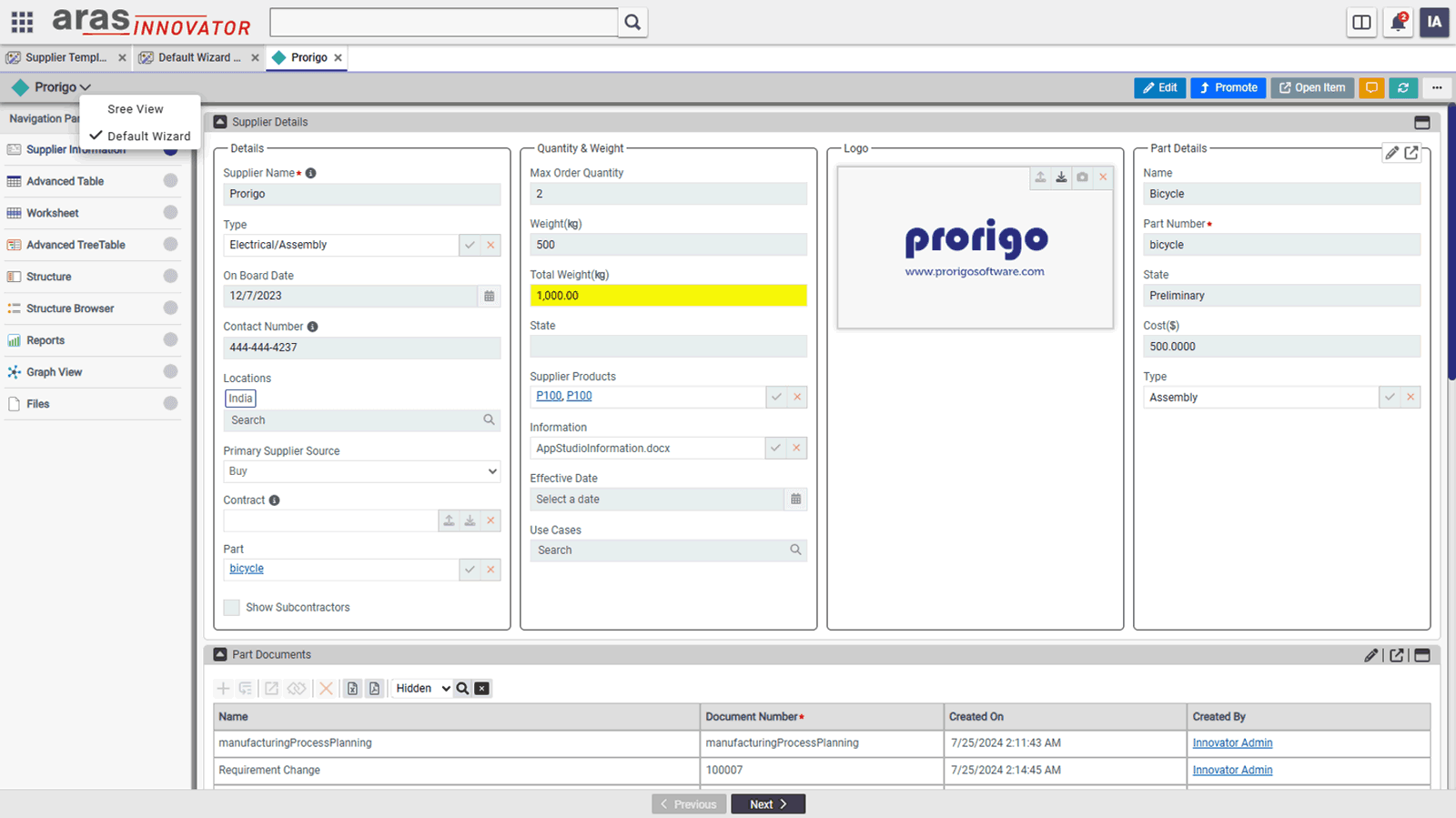
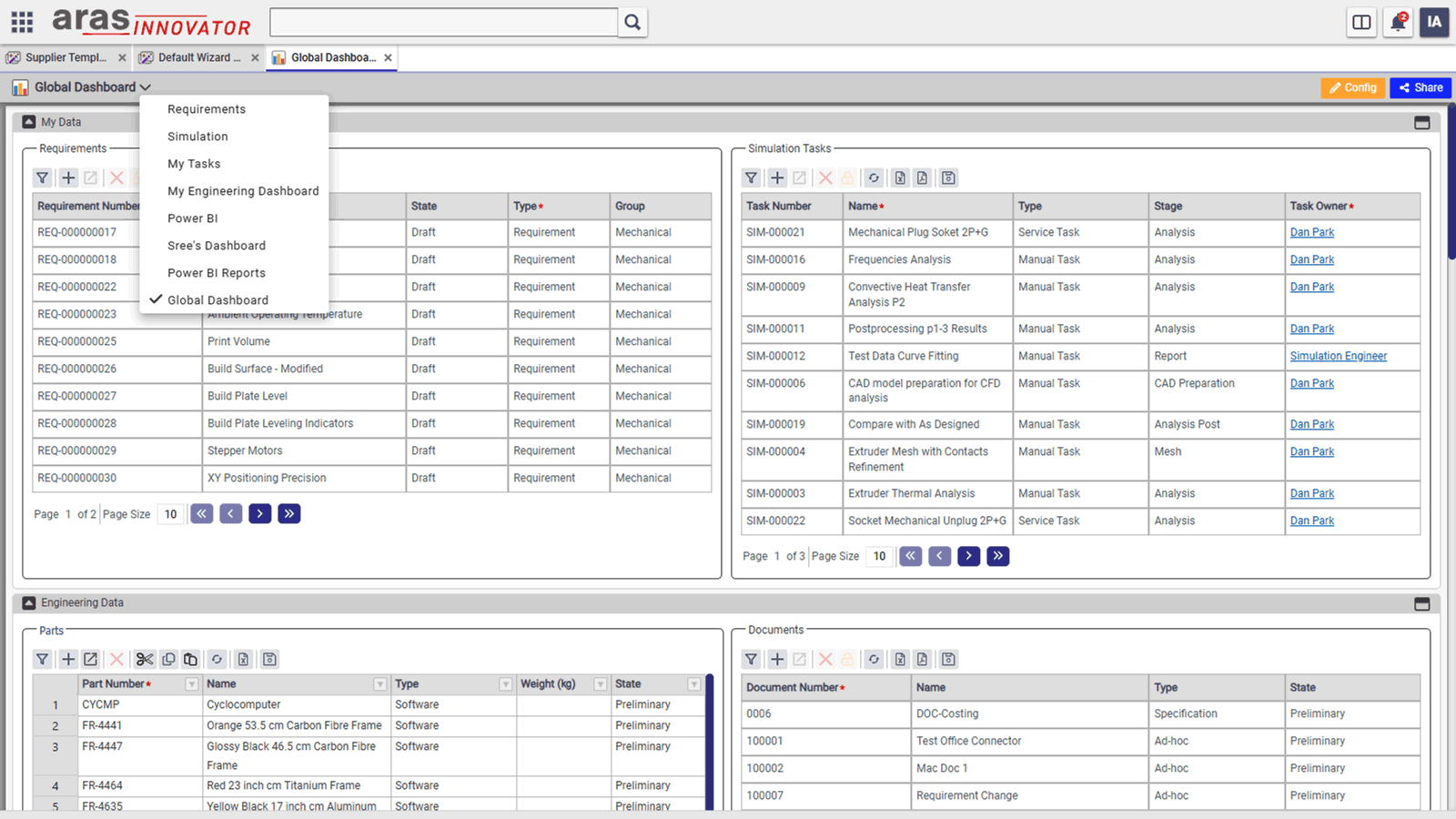
User Dashboards
- Custom Views for Users: End users can create their own views based on the admin-defined wizards and dashboards.
- Multiple Views per ItemType: Users can create multiple views for wizards and dashboards of an ItemType, alongside the default views set by the admin.
- View Configuration: Clicking the Config action opens a designer, allowing users to modify layouts, hide controls, and add new widgets from the widget library.
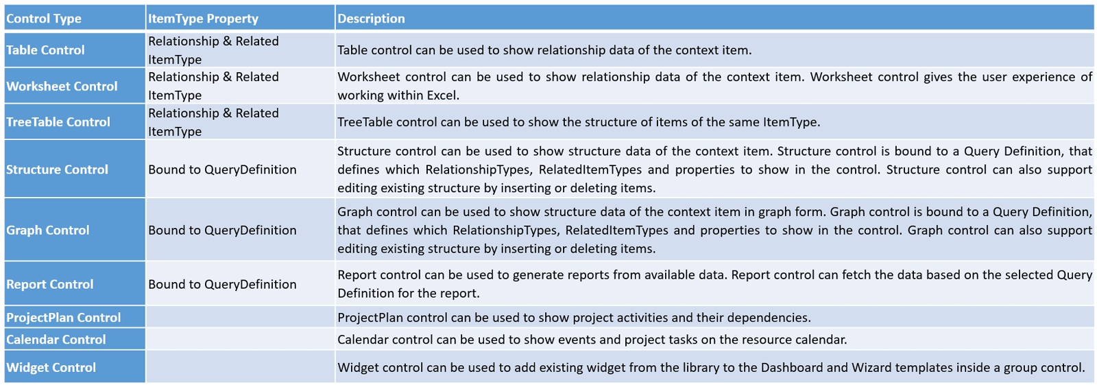
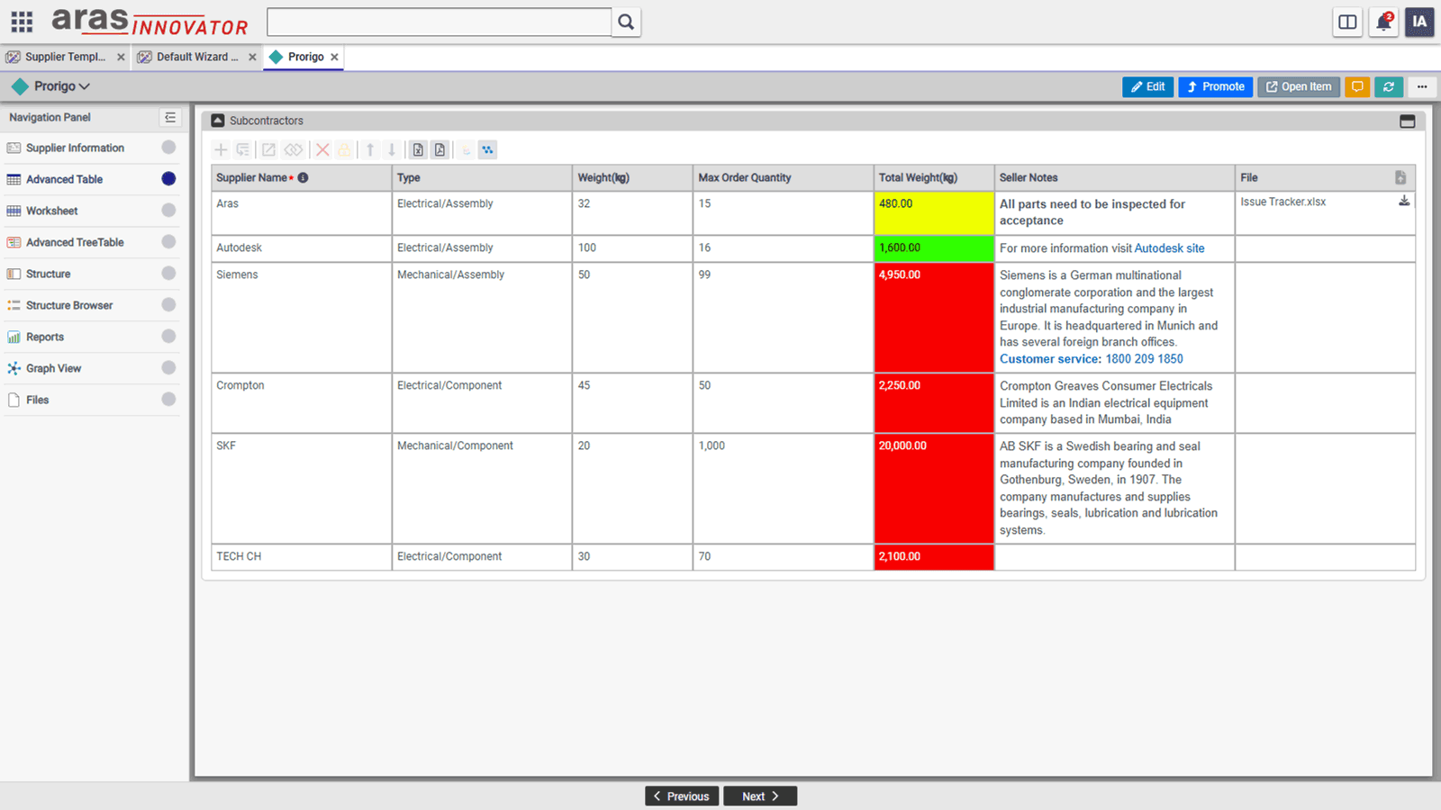
Advanced Table Control
- Render Relationships & Reference Data: Displays related items and reference data (e.g., WhereUsed items of a specific ItemType).
- Advanced Features: Includes Computed Columns, Validation Rules, and Conditional Formatting for enhanced data presentation.
- Variable Row Height: Adjusts row height dynamically based on cell content for better readability.
- Keyboard Shortcuts & Navigation: Supports cell navigation using arrow keys and allows Copy, Paste, Delete, and other shortcuts.
- Drag & Drop Row Reordering: Enables users to rearrange rows easily by dragging and dropping them.
- Flexible Column Width: Columns can be set in percentage or pixels, ensuring no horizontal scrollbar when using percentages.
- Cascade Delete: When a context item is deleted, all child relationships and related items are deleted automatically.
- Freeze Columns: Fixes specific columns to remain visible even when scrolling horizontally.
- Scrolling or Pagination: Can be configured to display data using infinite scrolling or pagination.
- High Performance Rendering: Efficiently renders 5,000 rows in under 10 seconds.
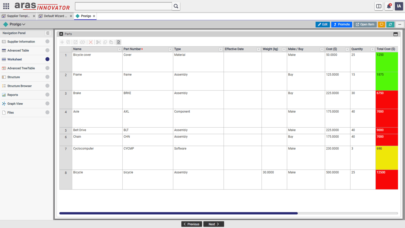
Worksheet
- Excel-Like Data Management: The Worksheet control provides an Excel-style experience for creating and managing data sheets with property-based columns constrained by data types.
- Advanced Data Handling: Supports nested rows from child relationships, computed columns, validation rules, and conditional formatting for enriched data visualization.
- Efficient Navigation & Editing: Includes cell navigation using arrow keys, drag & drop functionality, cell copy by drag, and undo/redo actions for quick modifications.
- Seamless Excel Integration: Allows copy-pasting between Excel and the Worksheet control, making data entry and migration effortless.
- Sorting & Filtering: Provides Excel-like sorting and advanced filtering options to refine data views efficiently.
- Column & Row Customization:
- Freeze Columns to keep specific columns always visible while scrolling.
- Adjustable Column Widths, set in percentages or pixels, preventing unwanted horizontal scrolling.
- Cascade Delete: Automatically deletes all child relationships and related items when the parent item is removed.
- High-Performance Rendering: Can efficiently render up to 10,000 rows in under 10 seconds, ensuring smooth performance for large datasets.
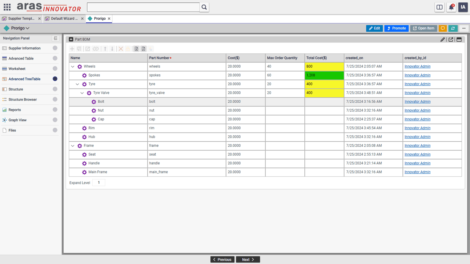
Advanced Tree-Table Control
- Hierarchical Data Representation: The TreeTable allows displaying child relationship data of the same root type as nested children within the table.
- Expandable Tree Structure: The first column visually represents the tree structure, with expand/collapse icons for nodes that have children.
- Advanced Data Configuration: Supports computed values, validation rules, and conditional formatting at all hierarchy levels.
- Inline Editing & Updates: Users can add, edit, or delete rows at any level within the same window, eliminating the need to open new tabs.
- Efficient Data Transactions: All incremental updates made at any level can be saved to the server in a single transaction, improving performance and consistency.
- Flexible Row Management: Users can add or insert rows at both the sibling and child levels, ensuring easy data organization.
- Column Freezing: Specific columns can be frozen to remain visible while scrolling, enhancing usability for large datasets.
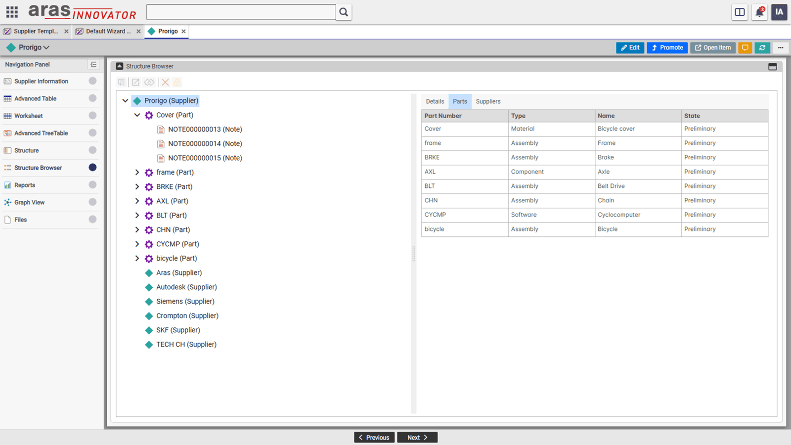
Structure Control
- Flexible Data Structure Representation: Supports displaying structures containing items of different ItemTypes and RelationshipTypes.
- Query Definition Binding: The structure is bound to a Query Definition, which defines RelationshipTypes, Related ItemTypes, and properties to be displayed.
- Interactive Editing: In edit mode, users can modify the structure by adding or inserting new children or deleting existing ones.
- Dedicated Right Panel: A separate right panel displays details of the selected node and its relationships for better visibility.
- Configurable Relationship Display: Users can choose which relationships appear in both the tree structure and the table on the right panel.
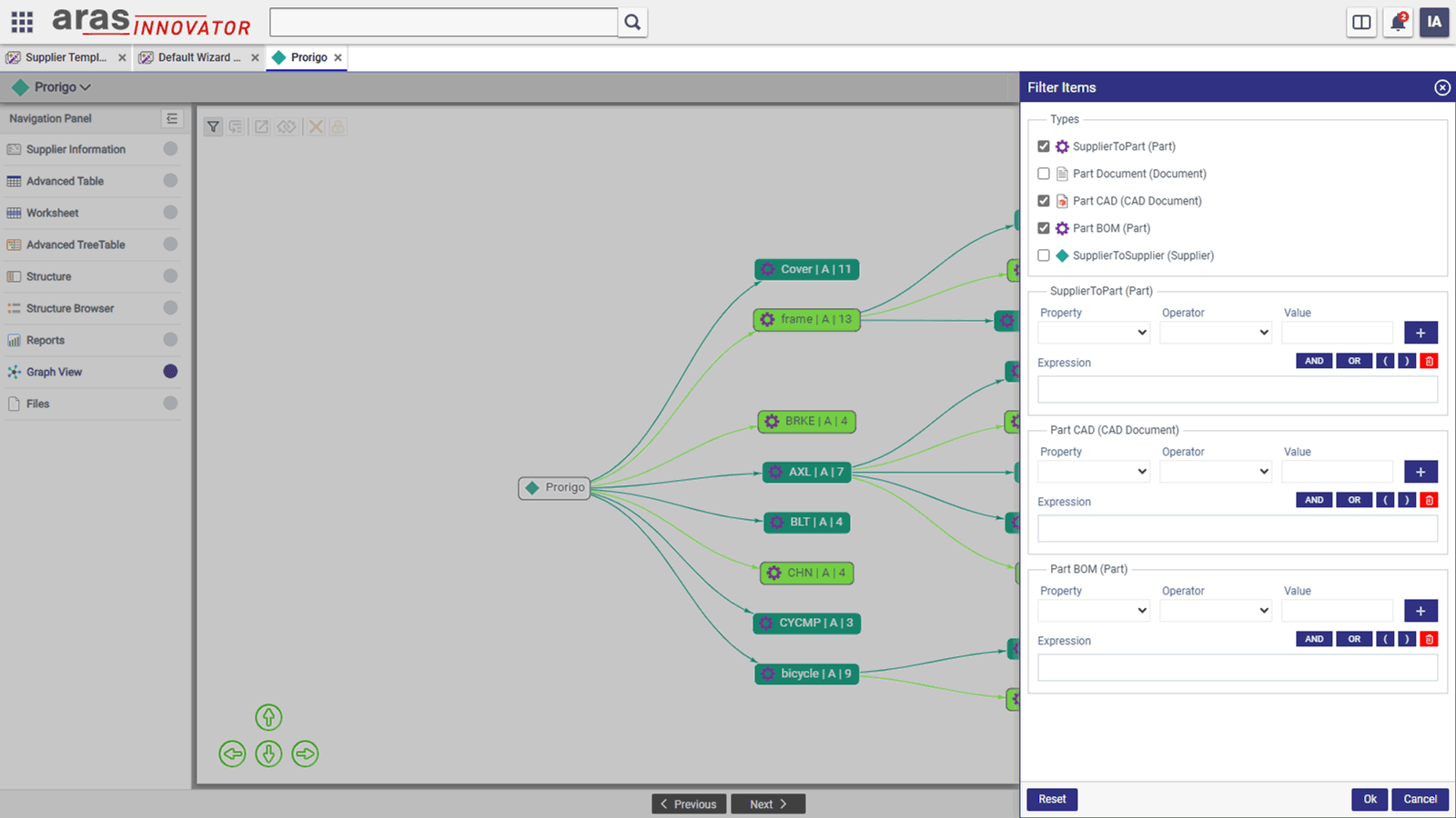
Graph Control
- Graphical Representation of Structured Data: Displays the structured data of the context item in a graph-based format for better visualization.
- Query Definition Binding: The graph is bound to a Query Definition, specifying RelationshipTypes, Related ItemTypes, and properties to display.
- Editable Graph: Users can modify the structure directly within the graph interface.
- Flyout Panel for Node Details: A flyout panel provides detailed information about the selected node and its relationships.
- Advanced Filtering: Enables filtering based on ItemType and its properties to refine the displayed data.
- Conditional Formatting Rules: Supports dynamic background color changes for nodes based on predefined conditions.
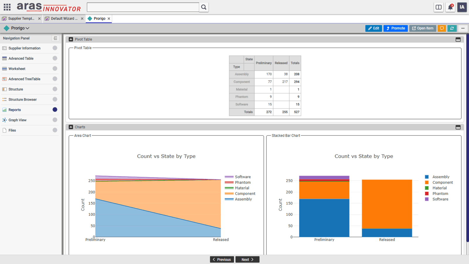
Report Control
- Comprehensive Reporting Capabilities: The report control allows generating various types of reports using Query Definition, Expressions, or Server Methods based on data in Innovator.
- Drilldown Reports: All report control types support drilldown functionality for deeper insights.
- Report Data Caching: Reports can cache data at User or Global scope, enabling faster access to previously generated reports.
- Local vs. Global Scope Reports:
- Local Scope: Displays Query Definitions that require a context item ID.
- Global Scope: Shows all Query Definitions available in Innovator.
- Report Definition Structure: Requires defining Function, GroupBy, and Columns fields as part of the report setup.
- Query Execution at Runtime: The report control executes Query Definitions to retrieve data sources dynamically.
- PowerBI Integration: Supports displaying reports created in PowerBI Server.
- TreeTable Reports: Enables report data to be displayed in either a Table or TreeTable format with dynamically generated columns.
- Supported Report Types: Pivot Table, Table, Heatmaps, Line & Bar Charts, Stacked & Area Charts, Pie Chart, TreeTable, PowerBI.
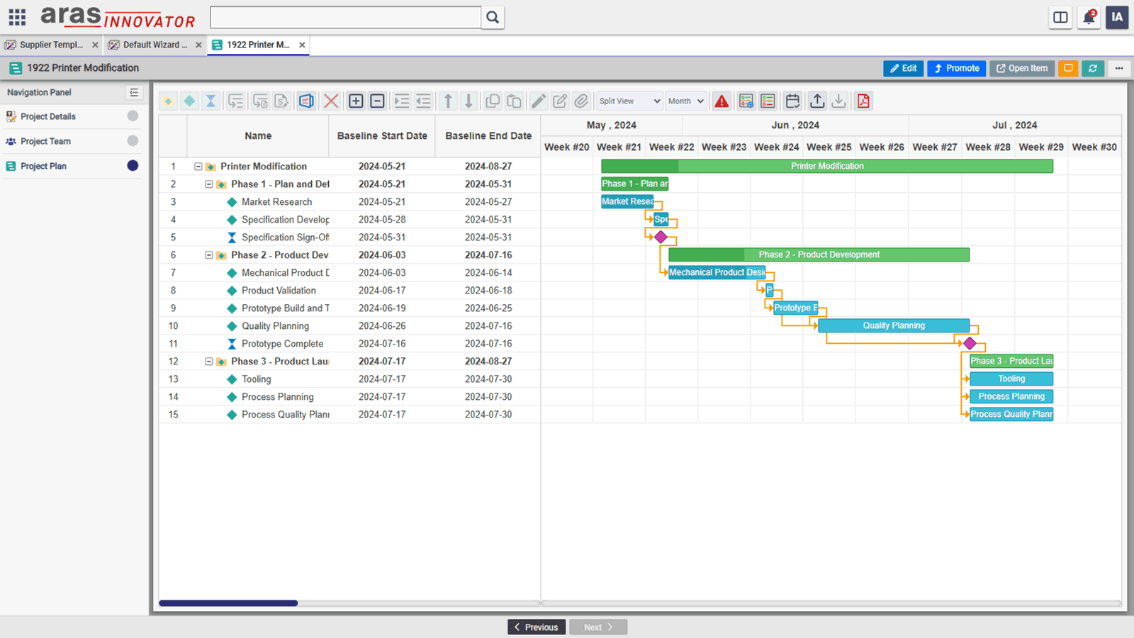
Project Plan Control
- ProjectPlan Control: Displays project activities from a project item in Innovator.
- Multiple Views: Supports Default (TreeGrid & Timeline), TreeGrid, Timeline, and Resource views for project planning.
- Editing Capabilities: Edit project plans in Timeline view and use inline editing for predecessors with precedence types in TreeGrid.
- Import & Export: Import activities from a project template and export/import MPP files.
- Auto-Scheduling: Automatically schedules tasks without saving the project.
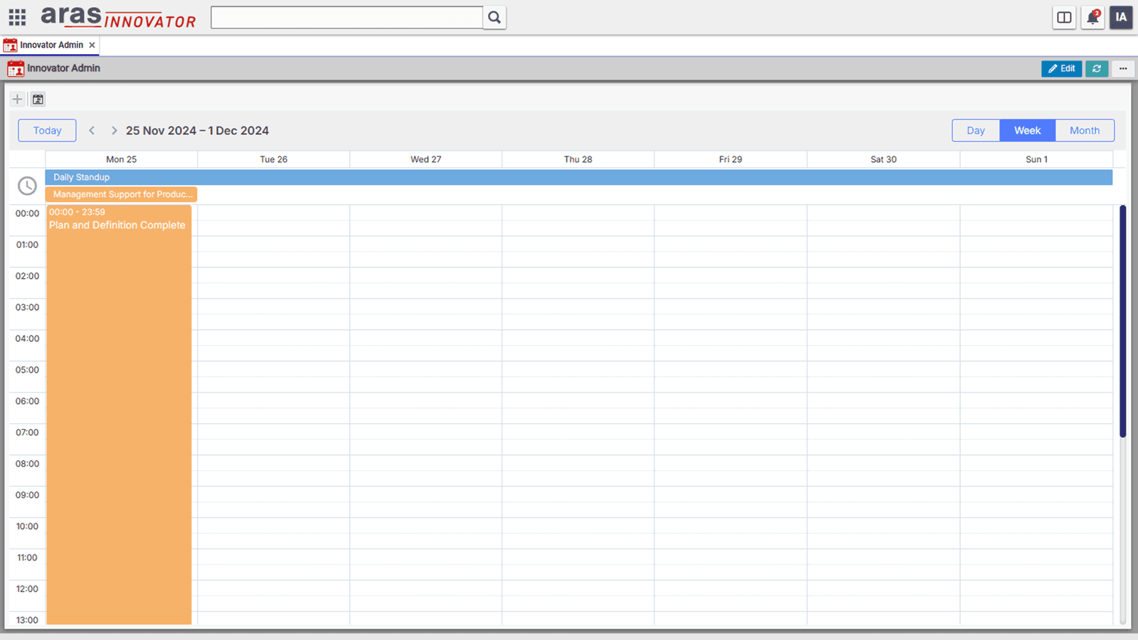
Calendar Control
- Calendar Control: Displays Working Days, Work Hours, Holidays, Events, Vacations, and Project Tasks at Organization, Project, and User levels.
- Organization Calendar: Defines Working Days, Work Hours, and Holidays at the organization level.
- Project Calendar: Inherits settings from the Organization Calendar but allows overrides for Working Days, Work Hours, and Holidays at the project level.
- User Calendar: Users can create Events and Vacations, view Project Tasks from multiple projects, open tasks directly, and mark them as completed.
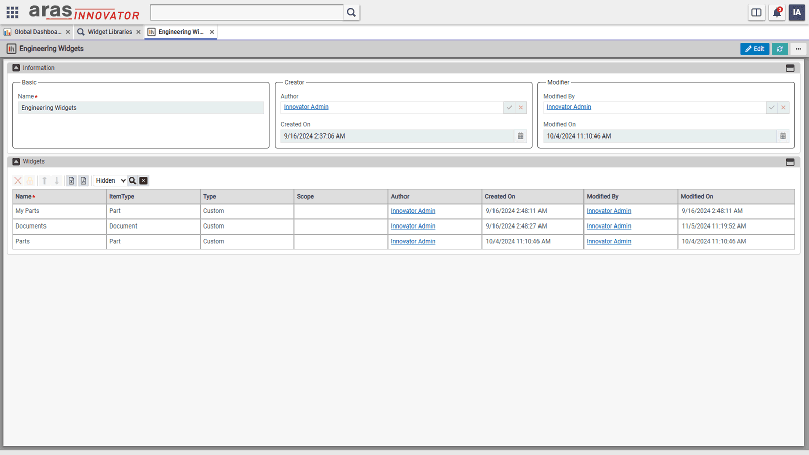
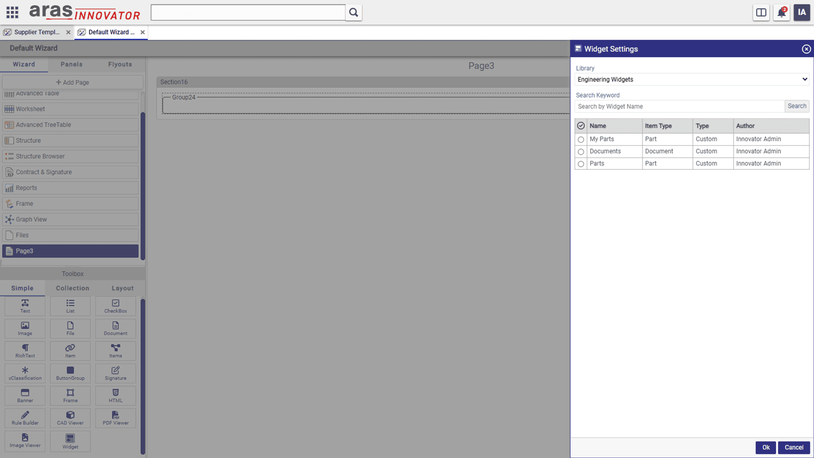
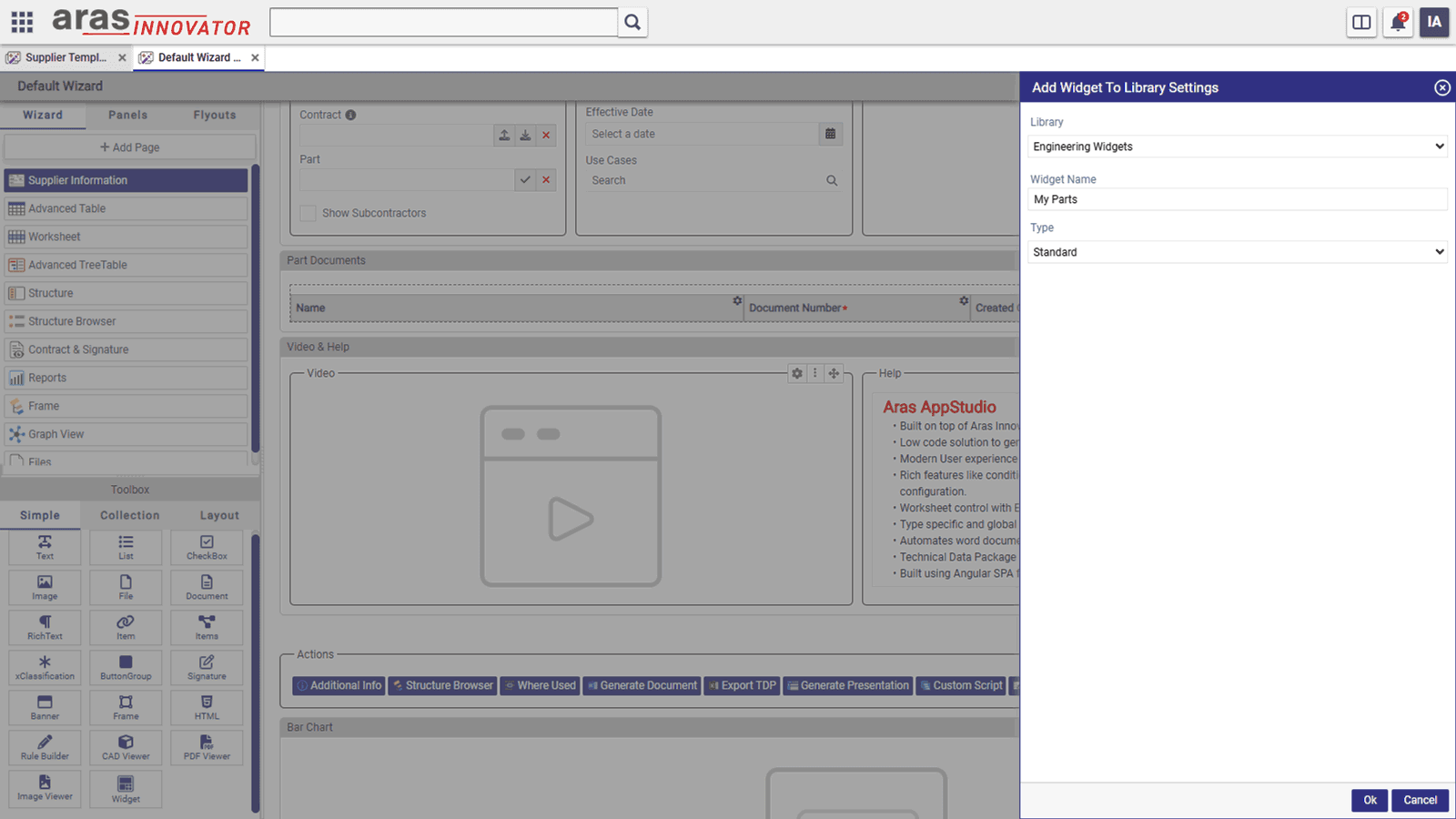
Widgets & Widget Libraries
- Widgets: Predefined UI components created from existing collection controls in a template, reusable across multiple templates
- Widget Libraries: Organized by admin, who can control access based on user roles.
- Adding Widgets to Library: Admins can add collection controls from wizard or dashboard templates to a library via the "Add Widget to Library" action in the control actions dropdown.
- Using Widgets in Templates: Widgets can be added to a template using the Widget Control from the toolbox.
- Widget Addition Methods:
- By-Copy: Copies the widget definition to the template, meaning future updates in the library won’t reflect in the template.
- By-Reference: Links to the widget in the library, ensuring it always reflects the latest updates.
Support for Products and Connectors by Prorigo Software
A dedicated team of support engineers is available to answer your queries, and provide help in resolution of any incidents reported, related to products and connectors developed by Prorigo.
Ready to Leverage ProAppDesigner?
Get in Touch with Aras!
ProAppDesigner is co-developed with Aras, offering seamless integration for enhanced efficiency. For more details about this powerful solution, please contact Aras. Prorigo specializes in implementation, ensuring a smooth deployment tailored to your needs.